Visual Studio 2022
Brand Updates
Overview
The DevDiv design team creates a new look and feel for every major release of Visual Studio. This work includes new product icons, splash screens, color palettes, illustrations, and potentially new themes in the product. The splash screens, color palettes, and product icons were developed on a tight timeline between March 2020 and April 2020, while the illustrations and themes were developed over a longer timeline.
For this project, I worked as Art Director, created the splash screens, and partnered with our Creative Director (Emily Stoll), icon designer (David Hose), illustrator (Don Baker), Product Designer (David Culbertson), and Design Developer (Cherry Wang).
Project details
When: March 2019 – October 2019
Role: Visual Design & Art Direction
Company: Microsoft, Developer Division
Setting the scene
What is Visual Studio?
Visual Studio is an IDE (integrated development environment) for Windows developers and is popular for .NET and C++ development.
How often are major releases?
Visual Studio ships a major release about every two years.
What is Dev17?
Dev17 is the internal name for Visual Studio 2022 product.
Phase 01:
Background
Visual Studio is a huge product, originally released in 1997. At some point it was decided that instead of making future releases of Visual Studio backwards compatible, each individual release could run side-by-side, meaning customers could have many versions of the product installed and running on their machine at any given time. This decision introduced a unique need to create new product icons and splash screens that are clearly distinct from previous versions for every major release.
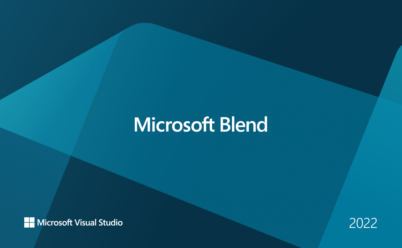
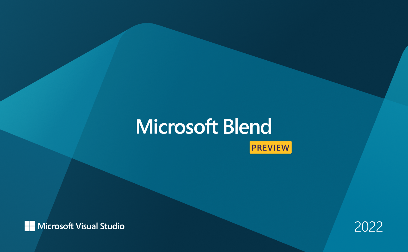
In addition to updating branded assets for Visual Studio, we also create new product icons for Visual Studio for Mac and new product icons and splash screens for Blend.
Previous Visual Studio product iconography
Previous Visual Studio Splash screens
Inspiration
Dev17 included a lot of technical improvements that drastically improved product performance and we wanted the new branded assets (product icons, splash screens, etc). We were also heavily inspired by the newer Microsoft product icon style seen here.
The ‘Ah-ha’ moment
We determined we could evolve the ribbon icon and bring it in line with the newest icon style across Microsoft. I also decided to use the overlapping form and curves to influence or splash screens and illustrations.
- - - - - - - - - - - - - - - - - - - - - - - - -
- - - - - - - - - - - - - - - - - - - - - - - - -
Phase 02:
Design explorations
Iconography
Our Icon designer, David Hose, got set on exploring different ways of redesigning Visual Studio’s ribbon. After multiple rounds of internal design reviews and partner reviews, we determined our new proposed icons.
We wanted to maintain our ribbon shape, but make the body of the icon take up more space within the canvas. This way it stays familiar for our customers while being easier to see at smaller sizes.
Illustration
In parallel to the iconography work, we also worked on our new illustration style. Our illustrator, Don Baker, and I worked together to define our new style. We began by creating greyscale spot illustrations.
Once we were happy with the spot illustrations we began expanding them to more editorial applications like landing pages, banners, etc.
Then we began exploring color. Around this time, we determined we could extend the style to all the products in the product family (which is also named Visual Studio) and set color palettes for each of the products and another palette to represent the family as a whole.
Color explorations for Visual Studio
Color explorations for Visual Studio for Mac
Color explorations for Visual Studio Code
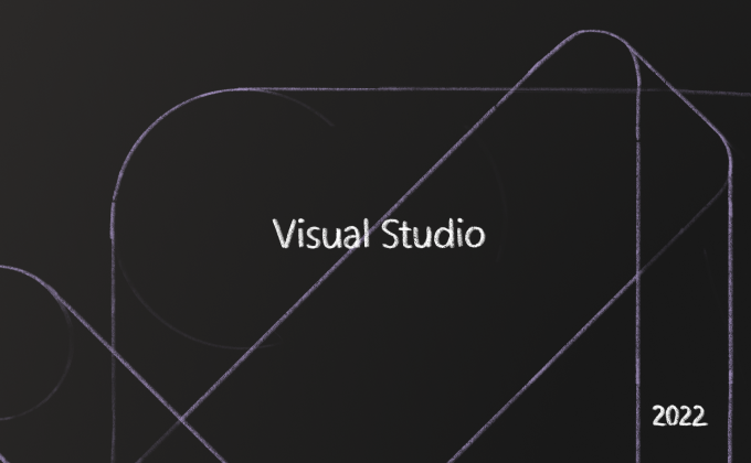
At this time, I switched to focus on creating the splash screens. I took the style Don and I were developing and began thinking through how I could take the basic forms in the product icon and extend them to the splash screen itself. I created some quick sketches in Procreate to quickly check composition and share ideas with the wider team.


Phase 03:
testing and Validation
We took multiple icon designs into quick pulse testing with our research team. We met with customers and walked them through multiple scenarios where they needed to identify Visual Studio icons. During this process, we looked to see if they could tell the difference between the current and previous icons as well as if they could distinguish the new proposed icons in the mix. During testing, we discovered that customers expected to see the color purple, and when the colors were too dark, it was difficult for customers to identify the icon. Explorations that took up more of the canvas and were more of a “blob” than a distinct ribbon also presented challenges for customers. We learned most of the customers didn’t actually know which icon represented which release, but they knew which one they used most frequently.
Phase 04:
Final designs
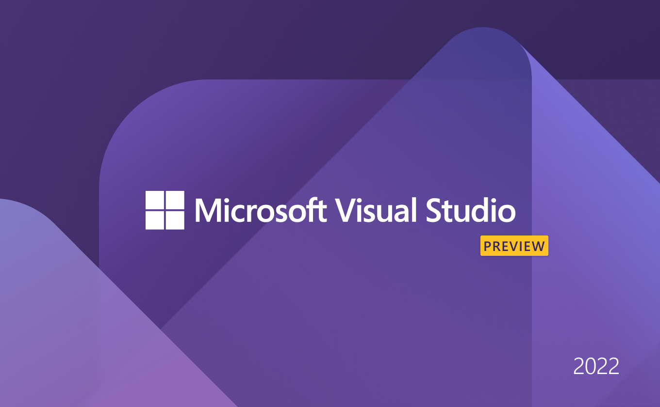
When Preview 1 launched Spring of 2019 it was so exciting to see our designs out in the world. Not only did our work appear in product but it also began to appear in blog posts, twitter threads, and YouTube videos.


What I learned from this project
It is possible to make something great on a tight timeline.
Even though the timeline for this project wasn’t ideal, we were able to pull together and create beautiful and identifiable designs.
Organization is key when working quickly.
Previous brand updates for major releases were fairly unorganized. When I joined this effort as Art Director, I felt a major part of my role was keeping the team organized, in sync, and moving forward. Without organization, we would not have been successful.
User testing is important, even for visual design
While I already believed user testing to be important, I found it extremely important for this project because the iconography is what identifies the product, and if customers don’t recognize it or have trouble seeing it, then we haven’t done our job.


