Webview UI Toolkit
Overview
While working on VS Code extensions in the Developer Division, I saw the need for a more cohesive set of UI/UX patterns and controls for webviews in VS Code. The extension toolkit is a UI component library for designers and developers to use while building web views for their VS Code extensions.
I initiated this project because I saw a need while working on other projects within the team. I lead the initial effort for the toolkit (design, research, and documentation).
Project details
When: January 2020 – July 2020
Role: Visual Design & System Design
Company: Microsoft, Developer Division
Setting the scene
What is VS Code?
Visual Studio Code (VS Code) is a light-weight, open source, code editor that can be customized through first and third-party extensions.
Why are extensions important?
Without extensions, VS Code is a pretty simple text editor, but the extensions bring a lot of the magic. Extensions can provide features like language support, special debugging features, data visualization, etc.
What is a webview?
A web view is an iframe within VS Code that an extension controls.
Phase 01:
Background
While I was working as an extension designer, I continued to run into the same few issues no matter the project. I also realized other designers and engineers across Microsoft were struggling to create cohesive extensions for VS Code for a few reasons:
01: There was not a design system for webviews
No design system or pre-defined patterns resulted in designers and engineers alike creating one-off solutions. This wasn’t very efficient and led to more fit-and-finish errors and product inconsistency. Designers not family with VS Code also struggled because the existing patterns and best practices were not well documented at the time.
02: Teams needed to maintain custom UI
Maintaining a custom UI is costly and can lead to a number of issues ranging from minor fit and finish bugs to larger accessibility bugs. One of the biggest complaints we heard from teams was integrating VS Code’s color tokens was confusing and sometimes difficult because the tokens had very specific names and use cases. This process requires a deep understanding of how VS Code's color themes work and the ability to predict how other themes handle colors. This is easier when it comes to the themes that ship with the product, but becomes more difficult when third-party themes are introduced.
Inspiration
When I looked across the landscape of first and third party extensions, I realized there were a lot of different design needs. Some applications just needed a data grid, some wanted to make a simple GUI introducing their product, and other wanted to create complex dashboards and experiences all within the webview. That’s a pretty big range of needs, but I decided to start with something I knew and use the Fluent Web design system as a base.

VS Code in a standard editor arrangement.

PlatformIO is an example of a complex, third-party extension in VS Code
The ‘Ah-ha’ moment
After assessing my own experiences and the experiences of other designers and engineers working across Microsoft, I had my ah-ha moment. I decided I should create a library of controls to share with the greater VS Code community, in turn making it easier for people to design and build extensions and eventually making a more cohesive product and customer experience.
- - - - - - - - - - - - - - - - - - - - - - - - -
- - - - - - - - - - - - - - - - - - - - - - - - -
Phase 02:
Design explorations
Designing a Figma Toolkit
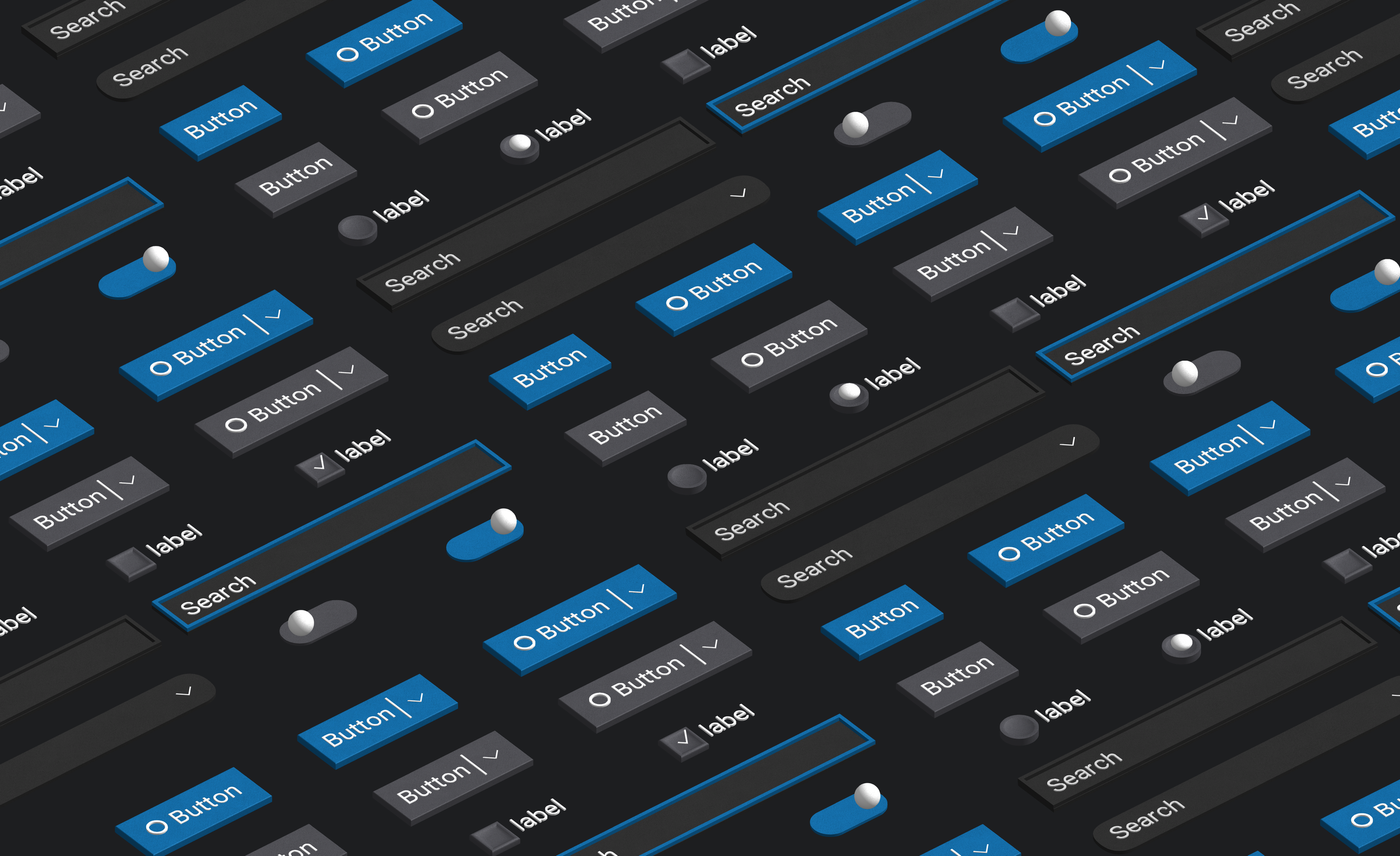
I used the Fluent Web design library as a basis for my new webview toolkit. I audited all the controls and met with the primary VS Code designer, Miguel Solorio, to determine which pieces we felt should and should not be included in our own set.
I then began building out the components in Figma. All of the components are built using Auto Layout, a feature that allows the components to adjust in size driven by things like the amount of text, the number of assets, etc.
The design toolkit includes:
Buttons
Text Fields, Search
Dropdown, Spinbutton
Toggle, Checkbox, Radio
CommandBar, Pivots
ContextMenu
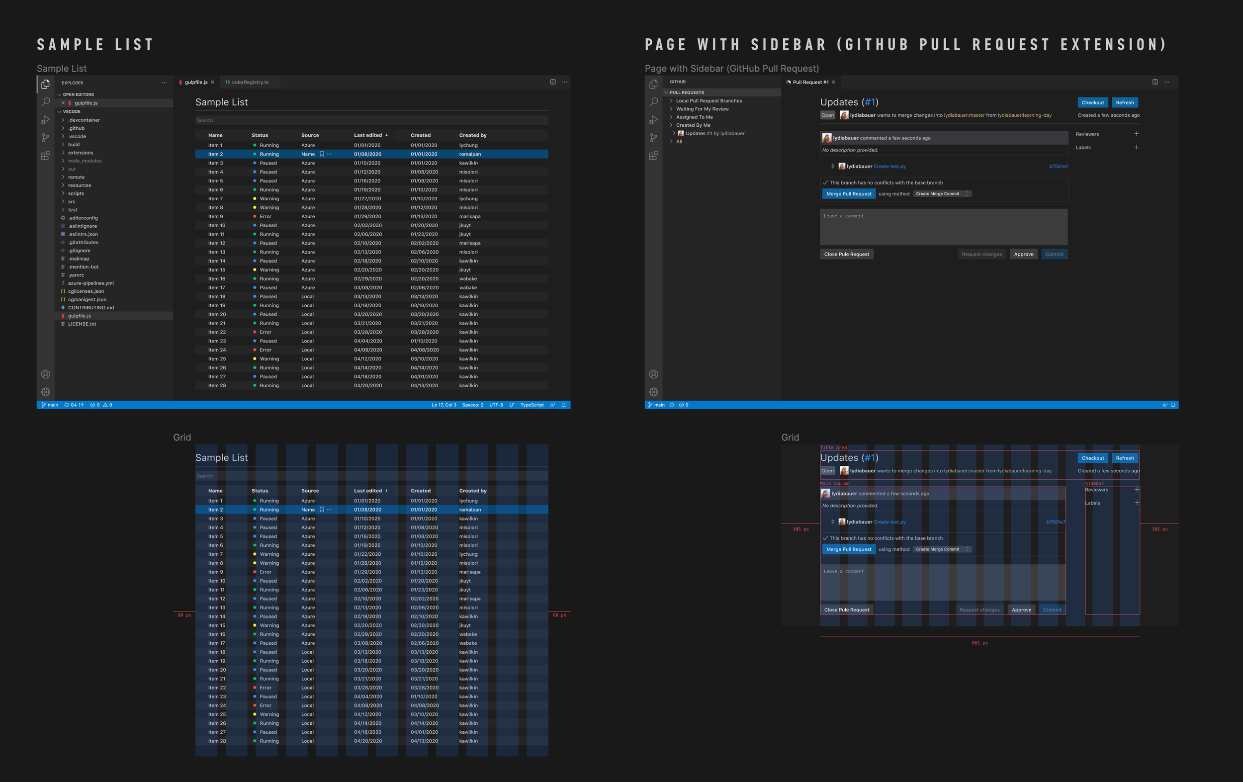
Lists (tables)
Markdown Preview Style guide

What’s a Figma Toolkit or Library?
Figma toolkits allow designers consuming the library to gain access to components and styles and use them in other files. Updates to the component library file also appear in files consuming the library. Makes life a bit easier :)


Phase 03:
testing and Validation
I met with five designers working in different parts of Microsoft that have worked on VS Code extensions; one from Teams, two from the Data Integration Team, and two on the Azure Data Studio team. In each of the interviews, I asked the participants to share their experiences with Figma before jumping into discussing the toolkit. The participants ranged in experience; some have only been using Figma for a month or so, while others have used it for over a year. All the participants had prior experience using toolkits and libraries, and only one or two had experience using Auto Layout in Figma.
Findings
All of the participants were able to navigate the toolkit and find different components. When it came to consuming the components in another file, some participants used the Assets panel in Figma, while others preferred to copy and paste components from the toolkit file. All of the participants discussed having a difficult time figuring out best practices for webviews in VS Code. Some mentioned looking for guidance in the VS Code Docs but said they couldn't find any. Three of the participants said they would like to see documentation explaining the different surfaces available in VS Code and how to use them.
Some NOT-SO-FORMAL testing
In addition to the study I ran with designers from across Microsoft, I also worked closely with different designers on my team who use Figma toolkits daily. This project was during the early stages of component libraries at Microsoft, so it was helpful to get feedback from designers using a variety of toolkits that were organized and maintained in a variety of different ways.
Phase 04:
Looking Ahead
As with most, if not all, projects, there's always a time when you move on to something else, and another designer takes over. Towards the end of my time working on the toolkit, I knew I was transitioning to a more branding and visual design-oriented role. This made me want to make sure the project was in a good state to hand off and easy for others to pick up where I left off.
Creating documentation
I determined we needed basic guidelines stating when to use what controls, how they should and should not be used, etc. Because our toolkit was heavily based on the Fluent Web Framework, I could heavily leverage the existing documentation and guidelines. I only needed to rework some of the guidelines for our specific use cases.
Prepping for HANDOFF
As a part of this “final prep process,” I cleaned up all the files, created documentation, and compiled notes to hand off to any future designers and developers working on the project. A few months after shipping our initial design library, a design technologist, Hawk Ticehurst, began building out web components for extension developers to use when creating their own extensions. Fellow DevDiv designer David Dossett later joined the team and began working on the toolkit. Version 1.0 of the toolkit launched on April 7, 2022.
What I learned from this project
If you’re struggling with a problem, chances are you aren’t the only one.
I was struggling with a lack of documentation and guidance, and I worked on the larger design team! This problem was even more significant for folks who couldn’t just walk up to the product designers or developers and ask questions. By solving the problem I was personally facing, I ended up helping many other people.
Organization is key when working quickly.
The best solutions aren't very helpful if people don't know about it. While developing a carefully thought out system was really important, it was also really important to share these resources with the larger community. This is not a one time thing, but a regular action that needs to be taken so everyone is included and made aware of the resources they can use.
It is really gratifying to make a complicated thing easier.
Theming extensions in VS Code still remains a challenge for people building their own custom UI, but the toolkit made this issue a bit easier.